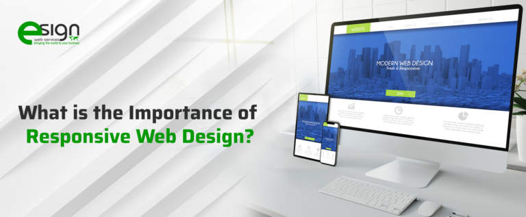
What is the Importance of Responsive Web Design?
There has been a significant hike in mobile searches lately. As of 2018, about 72% of the consumers expressed their preferences for mobile-friendly websites.
The numbers have increased since then, and even Google has made it one of its crucial ranking factors. Static websites hardly make it to the top of SERPs unless it has significantly high domain authority. This shift in search habits forced webmasters to adopt a responsive web design for their websites.
In 2019, the amount of web traffic from mobile accounted for over 52% of the entire mass. Experts also believe that by 2024, web traffic from mobile phones will increase about 5 times the number clocked in 2019.
Keep reading to know more about responsive web design, its importance and relevance in 2021.
WHAT IS RESPONSIVE WEB DESIGN?
“Responsive design” is essentially an approach that web designers use to make the web content-adaptive with different screen and window sizes in various devices.
This ensures a superlative user experience irrespective of which device an individual is searching from. It also highlights the important parts of a website in different screen sizes that otherwise may go unnoticed.
For example, the desktop website for an eCommerce website called Myntra looks something:

But its responsive mobile website version looks something like this:

RESPONSIVE DESIGN VS ADAPTIVE DESIGN
The primary difference between the two types of web designs is that a responsive design adapts a single page version’s rendering. On the other hand, an adaptive web design would create multiple versions of the same page for different pages. Both are crucial trends in the web designing industry at present, and a webmaster can choose either depending on his/her preference and approach.
In a responsive website, the visitors are accessing the same page through their browsers irrespective of the device type. Its CSS code will just render it in different ways for the corresponding devices. Whereas an adaptive design has a script that checks the size of a device screen and then lets visitors access the template made for it.
WHAT IS THE IMPORTANCE OF RESPONSIVE WEB DESIGN?
Designing a website for desktops is no longer enough, as more than half of the online traffic comes from mobile phones. It is not wise to lose potential customers, especially on such a big scale. This is especially necessary for eCommerce businesses as the possibility of making a purchase increases with mobile searches. About 6 out of every 10 shoppers in 2019 preferred purchasing products through their mobile phones instead of desktops.
If individuals, especially beginners, are still not convinced about why they should opt for a responsive design, there are numerous other reasons as well.
1. It Is Significantly Cost-Effective
Maintain separate websites for every device can significantly raise a business’s digital marketing budget. Startups and small businesses already struggle with collecting funds for the business itself; an added expense will only make things worse.
Having a responsive web design will provide the functionality of separate device-specific websites on one site. This will significantly reduce the expenses and time spent on maintaining multiple website domains.
A single design also maintains a uniform image for the brand across all platforms and helps customers recognize it better among other competitors. That one design will appeal to all types of visitors and generate positive results for the business.
2. Provides Flexibility To The Website
Responsive designs are also efficient at adapting to new changes and make them seem organic. Moreover, as there is only one website that one needs to work on, any change made on it will reflect across all platforms.
With the application of HTML and CSS, responsive web designs help to conveniently adapt and resize the webpages inclusive of all the visual content. This is applicable for any device. There are also options for higher website responsiveness wherein designers can use robust fluid grids, and thus, everything can be optimized to the proportion of each screen. Moreover, the task becomes a lot easier for the back-end teams as they only have to update a single version of the website.
3. Substantially Enhances User Experience
All the benefits of a responsive website lead to the ultimate user experience (UX) that pleases both Google algorithms and the visitors. Any individual who is acquainted with SEO understands how crucial UX is.
It only takes about 2.6 seconds for a visitor to form an impression of a website. Moreover, about 88% of individuals never return to a website if they do not have a pleasant experience on it. Hence, proper UX is essential for both conversion and customer retention.
About 50% of visitors judge the credibility of a website based on its web designs, further emphasizing the importance of responsive web design.
4. Provides Extensive Search Engine Optimization Gains
Several websites use a separate website for mobile and desktop, dividing the attention on proper optimization. Using a responsive design, thus, reduces the SEO burden and ensures an accurate website optimization procedure.
The main motive of SEO changes on most websites is to improve their rank on the Google SERPs. It is because the top five search results account for more than 67% of the total number of clicks.
It has been already discussed that Google rewards responsive websites with higher ranking as they are mobile-friendly. When combined with other advanced SEO tactics, this can substantially boost the website, helping it earn a better ranking with ethical practices.
5. It Makes The Website Easy To Manage
Startups and small businesses do not have an extensive workforce taking care of separate aspects of that business. Usually, a single individual looks after multiple areas of the company and hardly has any time to spare. Reducing the website management time by half, a responsive web design provides individuals with the opportunity to manage that single website better.
This will also make applying other elements of digital marketing much easier and hassle-free. Individuals will not have to decide between which website to link on social media posts and which redirect links will garner the right traffic to the right website.
These two websites can often compete to rank for particular keywords and significantly decrease one’s performance. Such issues can be avoided by just choosing to make the website responsive.
THE FUNDAMENTALS OF RESPONSIVE WEB DESIGN
As there are multiple screen sizes that exist across phones, namely phablets, tablets, gaming consoles, TVs, desktops, etc., it is crucial that your website can adapt to any screen size. Moreover, devices have different features using which we interact with them. Hence, responsive web designers need to keep these aspects in mind as well.
Nevertheless, the 6 main building blocks make the foundation for a responsive website design, and they are:
1. HTML and CSS
HTML and CSS are the two coding languages that control the layout of a web page in every web browser. While HTML dictates the content and structure of the page, CSS modifies the HTML element’s design and display.
2. Media Queries
One of the fundamental parts of CSS3 is media query which lets a webmaster render content that can adapt to different factors, like resolution and screen size. This works like an “if clause” in other types of programming languages and checks the width of a screen before executing the codes.
3. Responsive Images
It is one of the simplest iterations of responsive images and follows the concept of a fluid layout. It uses a dynamic unit and controls the width and height of the images. WordPress actually automatically uses this for images, including the ones in posts and pages.
4. Fluid Layout
A fluid layout is a crucial aspect of modern responsive web designs. In the early days of website designing, webmasters would set a particular static value for each HTML. However, nowadays, layouts are “fluid” or dynamic in nature and take values in percentage with respect to the viewport width.
5. Speed
It has been seen that pages that load within 2 seconds have a bounce rate of only 9% on average. Whereas, websites that take as long as 5 seconds have an average bounce rate of 38%. Hence, the page loading speed is one of the most important pointers to keep in mind during web designing.
There are multiple ways of achieving faster loading speeds, like optimizing images, minification, implementing caching, improving the critical rendering path, etc.
6. Flexbox Layout
Flexbox is a newly developed CSS module that is more efficient. It effortlessly lays out several elements even when the container’s content size is unknown. This was designed as many web designers felt that a flexible layout was not “dynamic” enough.
Several statistical surveys prove how essential a responsive design is in the present day and age.
SOME STATISTICS OF RESPONSIVE WEB DESIGN IN 2021
- About 38% of visitors will not engage with a website that has an unattractive web design. This will keep increasing the bounce rate of the website and result in poor ROIs.
- 57% of consumers in 2021 stated that they would not recommend a website that was poorly designed to their friends and family. This is a substantial loss of potential customers only due to poor user experience.
- Approximately 91% of websites for small businesses are not mobile-friendly. Therefore, if you are among the 9% that do have mobile-friendly websites, you already have a significant edge!
CONCLUSION
Therefore, you should understand that a responsive web design as of 2021 is not an alternative option but a necessary SEO practice. Any website owner who is skipping this is actually hindering the site from showing its fullest potential. It might not reach most of the targeted audience and lose a massive portion of the exposure.
Moreover, static websites also drop the potential of social media marketing and reduce the profit margin of that website. Thus, in 2021, responsiveness is the way to go.
Hence, this brief guide covered some essential aspects of responsive web design and why it is crucial for businesses in 2021 and beyond. It also covered the 6 key foundational blocks of responsive design that should be helpful for beginners and experienced ones alike.
Is there anything that you’d like to add? Feel free to add your comments in the section below!
Author Details

Ashwani Kumar Sharma
Ashwani has been actively involved in SEO services since 2005. His expertise and distinctive work approaches have made him one of the most experienced and trusted SEO experts in the industry. He is a certified SEO and Google Ads professional. He also has strong business development skills in advanced SEO, PPC, and digital marketing strategies.